We try to keep “upcoming release” information quiet here at Shirt Pocket, or at least relatively so, until we’re close to releasing new a version. The last thing we want to do is frustrate our users by announcing something and then not shipping.
But, let’s pull back the curtain a bit on the next release of SuperDuper!
As you might (or might not) expect, Bruce and I have been working on v2.0 for months. We’re working hard to achieve two main things:
- Improve the user experience even more
- Add scheduling
There have been a ton of changes to the way SuperDuper! works internally, each of which ties into these two goals.
I’d like to show you one example of what we’ve done, both to whet your appetite for what’s coming, and to show you how we approach changes. (If you enjoy this post, let me know and I’ll do the same for other new features, too.)
So, let’s start with…
The Status View
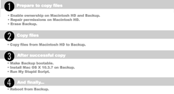
It’s not commented on a lot by our users, but the SuperDuper! status view—what’s displayed while the backup is going on—is a model of not-very-good design. Sorry to everyone who’s had to deal with it up to now, but there’s a happy ending, so read on!
While the existing status view gives basic information about what’s going on, it’s not nearly as helpful as the “What’s going to happen?” section of the UI that appears elsewhere in the UI. And it’s pretty ugly. And what’s up with those two progress bars? And, hey—I know it was successful and all—but what happened while I was away from the computer?
I could go on, but I think you get the point.
For background, SuperDuper’s UI is specifically designed to be as unambiguous as possible. I’m really careful to not use generic placeholders like “source” or “target”. I try to avoid some of the “conventional” backup terminology like “incremental” or “differential” because they tend to confuse and obscure what’s really going on. We try to cut our features to the bone to make sure the product isn’t overwhelming.
The idea is that I’m really trying to eliminate the worry that surrounds the backup process—that “Am I doing this right?” feeling that makes you not want to back up, or not be confident in the result.
SuperDuper’s simple UI, stripped down functionality, and “What’s going to happen?” section does this, as does its rapid and accurate operation. So, the question was: how do I carry that same feel through?
The first thing I thought of was: well, the “What’s going to happen?” part of the UI was pretty successful, so why not just do that? You could kind of “bold” each part of the description and turn it different colors as it went through… but, no.
Yes, the WGTH? section is reassuring and very popular with users. It’s a narrative of your choices. That’s very helpful when you need the “expert” pointing out what exactly you’re going to accomplish when you hit the button. But, once you’ve told SuperDuper to go and do the backup, you’re basically entering “Computer World”, where things are far more linear, structured and concise. Trying to shoehorn that into a paragraph just would not work.
Instead, I felt it needed to tell you things in a different voice—still helpful, of course, but more “mechanical”.
After thinking about it for quite a while, I settled on an approach based on a classic speechwriter’s maxim: first, you tell the audience what you’re going to tell them. Then, you tell it to them. Finally, you tell them what you told them.
And so, after a lot of prototypes:

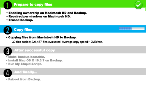
that’s what I did:
This is a real shot of a recent build of SuperDuper! v2.0, running an actual backup. I’ve broken the backup into different major “Phases”, each of which has a bar. A phase is grey when pending, blue when currently in progress, green and checked if successful, and red with an X if it failed (not shown).
Each phase has a number of steps, and each step changes to show whether it’s pending, current, successful or failed as well. The wording of the step changes, too, following the maxim: going to do it, doing it, done!
Everything follows our ‘no placeholder’ policy, and tells you exactly what drive it’s operating on, and what it’s doing. We’re also giving significantly more information about the process of copying (and will likely provide even more in the final version).
So, in the end, it seems pretty simple, and I think it feels pretty great in use. (The static picture here doesn’t show you the nice compositing Bruce does as the steps complete, nor the way that a step automatically expands when there’s more info to show, but you’ll see all that soon enough.)
What do you think?

14 May 2005 at 01:31 pm | #
I just recently purchased SuperDuper! and am in love. Thanks for all your hard work.
Just this small change is impressive and excites me for 2.0! Bring me to love^2, please!
14 May 2005 at 02:49 pm | #
Thanks, Ryan. More coming…
15 May 2005 at 09:59 am | #
Come on, Dave! Suck up your courage!! Just do it!!!
Type the ! when using the possesive.
Seriously, I finally took the time to read the blog and am looking forward to v.2. Even though v.1 does all I’ll ever need I’ll pay for the upgrade just so, like another writer has said, you keep doing such good work.
15 May 2005 at 10:07 am | #
I try to drop the “!” after the first use or so, because it makes everyone do a double-take… feel free to insert them in your mind, should you see fit.
Who said v2.0 was a paid upgrade?
15 May 2005 at 10:45 am | #
Hehe. Love your humor, Dave. ‘nother reason I pay.
Just ASSumed v2.0 would be paid. Seems like y’all have gone to a lot of work.
15 May 2005 at 07:02 pm | #
Excellent UI choice. Of course if you can’t or shouldn’t stop the process within any of these phases it’s not as useful as reading them before you start. If it is safe or safe at certain moments if you can actually pickup where you left off, then indicating where you might be able to Cancel, or Stop Safely, or Save for later, would be helpful. For instance in the back i’m running right now, wha would be the consequences of stopping the “Pre-scan to support fat block copying”?
I use SuperDuper and have been a fan of CarbobCopyCloner and I still wish I understood what a safety clone was! I have to admit that I couldn’t quite figure it out and have always jsut backed up all files. I should probably read the docs one mo time. Great app! Love it.
15 May 2005 at 08:25 pm | #
Nice work. I’m looking forward to 2.0 as well. Any issues with the current release on Tiger? I had heard 10.4 had some issues with mounting disk images > 1GB.
15 May 2005 at 09:14 pm | #
Chick: issue understood. We do prompt when you click cancel, indicating that the operation might leave stuff in a bad state (mostly image conversion)—making those messages sensitive to the command is a good idea that we’ll look into for the future.
At present, though, don’t cancel during image conversion…
If you have specific questions about the Safety Clone (see the blog post about that, too), let me know in the forums and I’ll try to help.
David: thanks! And, yes—Tiger issues are all listed in the FAQ, so take a look. The >1GB issue was first reported here, in fact.
16 May 2005 at 12:48 pm | #
SuperDuper has absolutely and wonderfully changed the way I manage backup and security. Thanks so much!
The new interface is obviously a great enhancement to an already superb program!
Best regards and thanks!
Joe Olson
16 May 2005 at 01:23 pm | #
If you add scheduling it would nice if you can add a trigger… Like if you plug in your backup fw drive the smart-backup will automatically start… that would be nice!
16 May 2005 at 01:27 pm | #
Joe: thanks! Glad you’re enjoying the app, and you’re going to love v2.0.
Jeremy: I’ll have a blog post about this soon, but let me suggest a terrific program from a 3rd party: Peripheral Vision. Using a simple AppleScript, you can already do this!
You’ll find Peripheral Vision at http://www.grantedsw.com/p-vision/index.shtml, and it’s a mere 6.95. Show ‘em some love—highly recommended!
16 May 2005 at 01:32 pm | #
Dave, just read the blog and really like your choices on the status display. Clear, concise and informative, while not putting me into info overload. The comment about providing an indication of when it’s safe to pause or stop a process was well put and is an important consideration. I can’t tell you the number of times I have chosen not to push some button because there was no info or indication about whether the process is reversible or stoppable—I have several times learned far too late that a process was doing something I didn’t want and there was nothing I could do about it. As you have noted above, forewarned is forearmed....
16 May 2005 at 03:18 pm | #
Using <source> and <target> to represent two pulldowns on the brushed metal panel --
1. There is an interesting inconsistency in the UI:
The brushed metal announces
Copy <source> to <target>
While some ofhe colorful bars announce
...Copy Files
Why “Files” in two places and not elsewhere? I thought I was copying the device/volume. Files implies NOT bootblocks, etcetera.
2. How about adding “from <source> to <target>” to the colorful bars as well—I know it is redundant, but the computer does the work, not you, and I need constant reassurance about what my machine is doing to itself.
3. How did SuperDuper “prepare” <source> and <target>? (Why did it need preparing? Remind me, please.) Reassurance, again.
You only have to code once, but I am forgetful and have clients who know next to nothing about what they are doing. Save me some time with them, too. They already all use SuperDuper if they want support from me.
3. The brushed metal references scripts - I know that “scripts” is what you really mean. But, as a user doing Smart Copis, I really don’t want to know about “scripts”. This is a hard one for me, I don’t have any alternatives to suggest except “method”. Sorry.
4. Time tags on completed actions would allow users to estimate the time for future invocations of the SuperDuper backup process. This information is also part of reassurance for me and for my clients—“It normally takes about <mumble> minutes for a 250GB drive like yours the first time.”, and, “Subsequent Smaprt Copies will only take about <mumble2> minutes and most of that is just checking things.”
16 May 2005 at 03:27 pm | #
I should mention that SuperDuper is paid for and doing fine on a dual G5 (10.3.9), backing up internal drives (250GB system, 400GB data) to external FireWire drives.
On a recent trip to visit Mac users in another country, we took the FireWire clones and used the host’s PowerBook to re-create the home environment away from home. Was great.
16 May 2005 at 03:54 pm | #
Some useful improvements there. When I looked at the blue bar in step 2 of your screen shot, I thought that was the progress bar and step 2 had finished, until I noticed the little progress bar on the right.
I guess that is me used to Safari using the whole address bar as the progress bar.
It is only a tiny thing, but would a slightly different background colour prevent that? What if did the safari trick and used the whole of each coloured band as a progress bar? That would make it easier to see from across the room. Just an idea.
16 May 2005 at 03:55 pm | #
Hi, xz4gb8…
Let me try to address your concerns (and please recognize that just because I’m disagreeing doesn’t mean your points don’t have validity):
1. SuperDuper! is actually copying files from source to destination. It doesn’t copy anything but files—so there are no ‘bootblocks’, as such, copied. (The volume, later, is made bootable, though.)
2. Just below the bar we do say “Copy files from <source> to <destination>… I’m not sure listing it three times on the same “page” is necessary in this situation…
3. Well, preparing is a step that involves a number of substeps that are kind of esoteric, but can take a little time. These include enabling ownership on the volumes, handling spotlight index stuff, etc… Detailing all that seemed a bit unnecessary—and can be seen in the log, should you need that level of info.
As above, I want to reassure, but mostly I want to “notify” and I don’t want to flood you with *too much* information… the status is designed to cut way back on the verbiage and focus on the important stuff… the real “details”, for those who need that info, are in the log.
3a (second 3). As I detailed in another blog post, I don’t like (to put it mildly) script either. Working on it.
4/5. I don’t like inaccurate estimates, and find them to be more of a nuisance than helpful… we can’t really even guess, since every machine is different…
Glad to hear it’s working well for you as-is, too!
16 May 2005 at 04:00 pm | #
Hi, Rob. An interesting idea, though I don’t know how I can retain a bar while striping another bar across it. Safari works because its in a “box” on white… you’d have to get awfully contrast-y, and that could also get headache-y.
The other thing is that there are indeterminate status states, too, that are sometimes pinwheeled and sometimes barberpoled… keeping all of those in the same general vicinity seemed like the best way to go…
16 May 2005 at 04:06 pm | #
Dave
This is probably a little far fetched (especially for the 2.x stuff), but I’d _love_ to see the eventual ability to do remote backups/copies with this stuff via ssh I know that ditto can do stdin/stdout just fine using this technique, as well as most, if not all of the command line stuff should be pretty much the same to initiate . . . it might seem a little strange to want this sort of functionality at first, but I can think of very many uses for this type of a deployment
I currently use some custom shell scripts with rsyncX + ditto to get this functionality, sans blessing the copies as bootable, etc—I can bless them on demand when I need to and I don’t generally do full bootable clones like this anyway, but for remote copies of user safety clones, etc it would be great to have .... not sure if it’s feasible with the mechanics you use in SuperDuper or not (esp the copy newer stuff but hey, we can all dream hehe).
Mark
16 May 2005 at 04:08 pm | #
Hey, Mark—yeah, that kind of thing is on the wishlist. But definitely not for the v2.0 timeframe!
16 May 2005 at 06:00 pm | #
I understand copying “Files”. I just want consistent terminology in every instance within the application. Put in the word or leave it out - just do it everywhere the same. Apply this also to the word “from” (not currently on the brushed metal thing).
Ah yes, I don’t like inaccurate estimates either. That is why my estimates are very accurate, even though reality hardly ever matches the estimate :
es·ti·mate (ĕs’tə-māt’ pronunciation
tr.v., -mat·ed, -mat·ing, -mates.
1. To calculate APPROXIMATELY (the amount, extent, magnitude, position, or value of something).
2. To form an opinion about; evaluate: “While an author is yet living we estimate his powers by his worst performance” (Samuel Johnson).
=================
Anyway, a knowledge of the actual time (cost) involved in performing an action, especially after performing the action repeatedly in a particular circumstance, enable one to estimate very closely the time (cost) required for another repeat of that action in that particular circumstance. Estimating the time to produce a code module or a hardware design or a gardon ready-to-plant is the stock in trade of a sucessful manager. Don’t let fear of inappropriate use of a tool prevent you from providing that tool to those who are capable of responsible use.
I, for one, will use the data to answer the wife when she says, “When can I get back to Photoshop?”
16 May 2005 at 11:09 pm | #
Thanks, xz4gb8—sometimes, I’m trying to be a little inconsistent. I can break out the old “foolish consistency” maxim here, of course. But I’ll look at these elements and see if there’s a way to make them a bit more consistent…
And, yes, I realize that an estimate is only an estimate, but it’s hard to do in this case. We have no idea how many files are going to be copied until we reach them, and if we were to try to run over them all to guess how long it was going to take to copy, we’d take as much time as if we just did it, to give a decent ‘estimate’…
16 May 2005 at 11:19 pm | #
Hello David,
Keep up the good rapport, as you well know, thats what keep the customers on your side.
I agree with xz4gb8’s request for elapsed time tags for each major step. It helps toward that warm fuzzy feeling.
At some point, I’m gonna stop being a bystander and will jump into your shirt pocket as a customer.
16 May 2005 at 11:27 pm | #
Hi, Bystander. Thanks for the feedback, and there’s plenty of room in the pocket for you!
17 May 2005 at 01:44 am | #
Dave,
You’re cheerfulness (?) here is admirable. I love SuperDuper! My only complaint is that when I write about it, people think I REALLY love SuperDuper! (because of the exclamation point).
Seriously, it has changed the way I do my backups, like actually backup regularly. v2.0 looks great. Consider me a satisfied customer and a guaranteed upgrader.
Gary
17 May 2005 at 08:18 am | #
Gary:
Cheerfulness, eh? Hm… how about “enthusiasm”?
And yes, it’s hard to write SuperDuper! without automatically saying that it’s really great. My evil marketing plan is working! Bwah-ha-ha!
Really happy to hear that it’s working well for you, though. Thanks for letting me know!
17 May 2005 at 03:12 pm | #
Hi, I’m really looking forward to v2.
I know you’re trying not to overload people with information, and at the same time provide some idea of what’s happening to provide that crucial reassurance that everything is going right. It’s a delicate balance, but sending people to the Log for more information is a little harsh.
I would really like it if SD could show a list of all directories at the beginning, and then “check off” each directory as it is completed. That way I could see at a glance what’s been done, and how much is still to be done. What would also help is to show next to each “checked off” (completed) directory the number of files copied and the number of files skipped/excluded. That way if there are certain directories I know & care about, I can get a quick sanity check that the right number of files are being copied. For more detailed information I’ll happily go to the Log.
I feel that the above strikes a good balance between simplicity and infromational value, more so than the situation where you need to switch between a simple “now copying” indicator and the Log.
Thanks for a great product - I evangelize it everywhere I can.
Chris
17 May 2005 at 03:58 pm | #
My son has his first new Mac and ext FW drive. I’m giving him (paying for) SD! to use as his BU app. Any reason that he should wait for 2.0? It appears from the chatter here that upgrades from the current version are free. Dat right?
17 May 2005 at 05:01 pm | #
Chris:
The only problem with this kind of thing is that there are literally thousands upon thousands of confusing folders/directories on an OS X system. Listing them and checking them off would be more “noise” than useful to the vast majority of our users. But, I’ll continue to think about ways of visualizing this.
Jon:
It’s a free update, so no reason to wait for v2.0.
20 May 2005 at 11:55 pm | #
The biggest improvement for me would to be able to back up over the network like Retrospect does, using a client on the remote machines. Then I would ditch Retrospect and hapily pay more $$ for SuperDuper. EMC is forcing an upgrade to move to 10.4 and I am one of many people who do not want to pay any more to EMC/Dantz....
22 May 2005 at 01:02 am | #
Re: status/progress indicators
• Inserting “of N” in the “N of N files evaluated” status text would be helpful
• Updating SD’s Dock icon to indicate progress/status would be convenient for monitoring, especially while SD!’s in the background
22 May 2005 at 11:33 am | #
A proud paid owner of Shirtpocket 1.5.5!
I’d like to see TIME ESTIMATES. I know these things can be difficult to estiate Even if they are off by a factor of 2 % it would be better than nothing at all. I imagine your progress bars are based on something. Is that # of files, amount of space, or a time estimate?
Thanks,
Alex
22 May 2005 at 11:38 am | #
Thanks for the suggestion, Alex. Alas, it’s very likely that they’d be off by a lot more than 2% the vast majority of the time.
The progress bars are based on the total amount of space taken by the files. Since we have absolutely no idea how many of those files are going to be copied, attempting to estimate based on the size of the data to be examined won’t tell us anything (but it does tell you about how far through the disk we are).
We could give a relative guess when doing a total, full, complete backup (thus backing up most of the files), but that’s not a typical case…
Anyway, we’ll look into this further for a future release. Thanks.
31 May 2005 at 01:07 am | #
Good job guys for this soft. I will love a feature like this : A mail notification that SuperDuper did the clone with a summary in the body.
I use Chronosync (http://www.econtechnologies.com/site/index.html) for Backup (not cloning) and it has this feature, very handy.
31 May 2005 at 07:36 am | #
Thanks for the suggestion, Maher. We’ve had that same thing asked for a few times, and we’re looking at it (though not for v2.0).
Note that it can be achieved in the current version with a “Site customization script”, though. That’s just a shell script that’ll run after the copy completes successfully—you can easily write something to send a little mail message…
02 Jun 2005 at 08:15 am | #
The email notification could be handled by Growl, with the bonus of getting lots of other notification options. I would *love* to see Growl support in SuperDuper!
02 Jun 2005 at 08:20 am | #
Yep, that’s one of the things I’ve been looking at, Adam. The only problem being that Growl is (relatively) unknown by the average Mac user…
16 Jun 2005 at 03:16 pm | #
This is a great piece of software, I am currently using version 1.55 v74 and looking forward to version 2. Your software has un-complicated my daily routine. Thanks!
16 Jun 2005 at 03:18 pm | #
Thank *you*, Gary! I’m glad you’re enjoying it!
16 Jun 2005 at 04:30 pm | #
Is v2.0 going to include extra hooks for Tiger’s Automator?
I ask not because I’m even a Tiger user. I’m a Windows user (since 1990) about to defect, and am lining up what’s needed. Backup seems to be a weak spot in Tiger (other than this, Tiger seems to have almost everything a basic user needs right out of the box). And even things advanced users need.
K.
16 Jun 2005 at 04:32 pm | #
Although the first version does not, it’s on our radar. But that doesn’t mean it’s not scriptable—it is. In fact, our own scheduling is based around AppleScript—which, after all, is what Automator uses.
27 Jun 2005 at 06:31 am | #
I’m in the process of restoring my hard drive after a crash. Fortunately I did a backup right before! A miracle, I’m sure. But this experience got me looking into backup and disk copy solutions again. Right now, I use Retrospect to make a duplicate onto an external drive and it takes FOREVER to simply copy files (that is after the 20 minutes it takes to SCAN all the files first).
Anyway, your program looks very exciting to me. I particularly like the attention to clarity--something we’ve never had with Retrospect. But there’s one thing I need that I’m not sure I would get with yours: Can I backup to a FOLDER on another drive rather than the root of the drive? I backup several disks to separate folders on one huge external drive. All the screen shots look like it just does entire-disk to entire-disk copies. If so, it would be really helpful to make that clear on your web page.
If so, I can set up my less-technical relatives with this backup solution! Thanks for giving us a preview of version 2. I’m sure the advance input will be helpful.
27 Jun 2005 at 06:48 am | #
Hi, Greg: that was, indeed, lucky—congratulations, and “phew!”
Although we can’t back up directly to a folder, we can back up to a sparse image which can then be placed anywhere. It’s basically the same thing—but you end up with a “rooted” copy which is much easier to restore in the event of a disaster, because you can even use Disk Utility—when booted from your OS install disk—to do it.
See this FAQ entry for more information, or drop me a note at support if you have any questions.
28 Jun 2005 at 03:34 am | #
I’ll try out the sparse image idea. I’ve played around with them some time ago but not lately.
BTW, my restore seemed to go OK and I’m back in action now, but I’ve discovered that all the folders (and thus all of the apps that are packages) now have today’s date. :-( It seems that Retrospect wasn’t preserving the folder dates in either direction (now that I’ve checked). So I will try out SuperDuper! tonight.
One thing, though--in your V2 designs, it might be helpful to build in some support for the sparse image backup technique. i.e. not require me to mount the image ahead of time and unmount it afterwards--let me select an image file to use as the target. Maybe I can write a script for now. I want to hook it up to the blue button on my drive for a one-touch backup.
Maybe you’ve already got this covered, but just in case…
Thank you for your positive attitude in this blog. It’s refreshing.
28 Jun 2005 at 06:43 am | #
Wow, I just tried it and it mounted the sparse image for me! Cool. My backup drive is much less encumbered now with extra files now that they’re all hidden in a disk image.
OK, I’m convinced! I just bought it.
28 Jun 2005 at 07:31 am | #
Hi, Greg—glad you found the auto-mounting. We also will mount a network drive, if it’s stored there, and then mount the image, so it’s pretty cool…
Thanks for your registration!
20 Jul 2005 at 12:34 pm | #
I love SuperDuper. In fact, I am buying a second copy for my wife’s computer. I would love if V2.0 had a better UI for scheduling and I see that you are palnning to have that. Any hints on how it will look?
20 Jul 2005 at 12:45 pm | #
You bet—check the various Scheduling posts in this thread, Morris!
20 Jul 2005 at 12:48 pm | #
(Oops—not “this thread”, but “this blog”, of course!
20 Jul 2005 at 09:00 pm | #
hmm. What about building a catalog db of backed up files… (for version 3.0 mb?) You know, something like “ah, I worked on the project xyz last year, on which backup drive are the initial drawings ? “
20 Jul 2005 at 09:11 pm | #
Well, the thing is that there are a number of file cataloging applications out there—and since it’s not something that’s requested very often, it’s difficult to justify the UI/complication involved in providing the functionality.
That isn’t to say it’s a bad idea: it’s not. It’s just that one of the “good things” about SuperDuper! is its simplicity. So every additional feature we think of goes through the “is this necessary?” filter…
I hope that makes sense… it’s one of those things I’ve got to do a blog post about…
21 Jul 2005 at 02:52 pm | #
I totally agree with the overall philosophy Dave (keep it lean and slim), however that kind of feature in terms of UI for the user could just show as the familar finder-window style search field in the window top, maybe with a greyed “search archived” in it.
Obviously on the backend engine it would be a lot of work. If you were to put this feature in maybe you could leverage the spotlight engine-libraries to help you. Who knows if apple did it right you might even have a query result window for free ? I have no idea, I am not a coder, just throwing things out at you
21 Jul 2005 at 03:30 pm | #
Well, not really. Because, the whole concept of “archives”—something most users are doing—has to be exposed. And then we have to put the “database” of files somewhere. And it has to be created and managed… and you have to have a way of “getting rid of” archives, and…
Even things that seem simple have significant ramifications, Nicolas, truly…
21 Jul 2005 at 05:20 pm | #
Something I’ve been curious to know is how SD! decides which subset of file/directory names to add to the log during a backup. That info may helpful for figuring out how to tune a couple SD! scripts which currently traverse hierarchies that could be ignored since nothing in them is ever backed up.
28 Jul 2005 at 09:12 am | #
What happend behind the curtain since may 14.th
When will SuperDuper 2 be ready?
28 Jul 2005 at 09:29 am | #
As soon as it’s done, Fredo!
29 Jul 2005 at 08:55 pm | #
I bought it, but I don’t seem to be able to schedule daily backups - something I could do on the pc before I junked it.
-- Eagerly awaiting your new release.
29 Jul 2005 at 09:09 pm | #
For now, see Section 12 of the User’s Guide, Mark… we show you how to schedule manually there. (It’ll be much easier in v2.0, as you can see in this blog...)
02 Aug 2005 at 08:36 pm | #
SuperDuper! is amazing. I just came across it at work, and I can’t believe the genius of this app. I plan to buy it next payday . I really like Rob’s suggestion about using the entire “in-progress” section bar as a progress bar. Perhaps the blue could inch forward, covering the grey, as the progress increases? When the step finishes, you could implement a snazzy “fade-to-green/red” transition in there. I’d love to see that in v2.0. Tell me if you need more clarification.
02 Aug 2005 at 11:40 pm | #
I’d like a dynamically updating Dock icon (similar to Toast’s) for monitoring SD!’s progress if the main and/or log windows aren’t visible. Oh, I’ve already mentioned that.
03 Aug 2005 at 07:15 am | #
ABK:
The problem with using the whole bar as progress is it’s pretty non-standard. While Safari used its Address Bar to show progress (and NetNewsWire did something similar in its own progress bar), I can’t think of any other Mac applications that use general UI elements for progress… especially not one this big and prominent.
So, while it might look cool, I’m not sure it’d be elegant… and it’s definitely be rather nonstandard. (There’s also a problem with indeterminate status - the two apps that do this always have known progress.)
Anyway, always something that can be enhanced in future versions!
SJK:
Yep. It’s not an unknown request, but it probably won’t be in v2.0…
04 Aug 2005 at 12:47 pm | #
I just linked to your website for the first time. Your app sounds great. I have Tiger and need scheduling so my question is, rather than pay for your app now and then pay another $20 for v2.0 which is what I really need, about how long is the wait for 2.0? I mean just a ballpark guess and we won’t hold you to it - are we talking days, weeks or months? (and no fair “sometime between tomorrow and Christmas").
Thanks for listening.
04 Aug 2005 at 03:10 pm | #
Gary—welcome to Shirt Pocket, and to my blog. You’ll see, elsewhere in the blog, that v2.0 is a free upgrade for all v1.x users, so there’s no need to wait.
As far as shipment date goes, despite your dilligent effort to tie me down, I can only say we’ll ship when it’s done.
I’ll be doing a progress report on the blog in the next few days, but as a preview, we have one more feature to complete, and then it’s all finishing the polish (and the documentation).
08 Aug 2005 at 01:51 pm | #
To follow up on what Alex was suggesting I also second the idea of a time estimate. Even if it’s off by 25 or 50% and the estimate has to constantly change as the process progresses that’s OK: having some idea is helpful.
To use an example from the video world, I use Final Cut Pro and we are constantly rendering effects and needing to know how long they will take--mainly because rendering disables any other use of the app. When rendering, FCP gives you an estimate on how long it will take but it’s an inaccurate, constantly changing estimate based on extrapolating how long each frame is taking to render and how many frames it has left to do. It doesn’t know how long each frame farther down the timeline will take so it bases the estimate on how long the frame it’s working right now takes. If it starts with easy frames, it will give a falsely short estimate of time. If it starts with a non-representative hard frame, it will estimate a falsely long estimate of time. As the render progresses, the time estimate is constanly updated and it gets more and more accurate as the amount of work left to do is extrapolated.
My long-winded point is something like FCP’s constantly updating estimate would be fine for SuperDuper.
08 Aug 2005 at 02:25 pm | #
Thanks, Carl.
Final Cut Pro, and similar programs, know ahead of time how much work they have to do. SuperDuper!, on the other hand, doesn’t: even though a given chunk of file might take a fixedish amount of time, given what Smart Update does, there’s no way to know how many chunks we’ve got to copy ahead of time.
So, the time would be hugely inaccurate, most of the time…
08 Aug 2005 at 02:50 pm | #
I want to go back to an earlier point about status information.
I don’t want you to script some fancy estimation. I just want start/stop/elapsed time per step. I repeat the same process with essentially the same data (200GB +/-, 300 GB +/-, system and photo drives). The incremental on the system is logs and email. The incremental on the photo drive is whatever we just downloaded or have process in the ‘darkroom’.
Given the data amounts and times, I will develop my own (typically eyeball) estimation algorithm. And, be very happy to do so!
08 Aug 2005 at 02:55 pm | #
Well, it finally happened. I went to the G5 to start the system backup and found it booted from the backup. It took Disk Warrior to rebuild the main drive. Now to resync using “newer files”.
SuperDuper saved my ... bacon!
08 Aug 2005 at 02:57 pm | #
Thanks for the additional detail, xz4gb8.
We’ll keep these requests in mind as we move beyond v2.0… thanks for them.
08 Aug 2005 at 03:00 pm | #
(And, phew! Glad your backup was up to date!)
10 Aug 2005 at 08:05 pm | #
Dave,
Do you know if there are any widgets being created to interface with SD! ? I heard that the newest version of Backup (v3 I think) for [dot]Mac will include widgets to do backups quickly. You can check here: http://www.thinksecret.com/news/0508dotmac.html to explain more of what I’m talkin’ about.
I’ll be surprised if your answer is “yes” but hey, it’s free to ask ...
Steve
10 Aug 2005 at 08:35 pm | #
A widget is kinda overkill. I have a couple “settings” that I use and each have a keystroke to activate. A widget uses RAM. I *do* like the ones I use, but they ain’t the be all and end all of software. I use MenuMaster (some of the best $$, short of SD!, I’ve ever spent) to set keystrokes. But, IIRC there are some freeware apps you can use to set F-keys and maybe the Keyboard / Mouse Preference Pane’s Keyboard Shortcuts could assign something.
11 Aug 2005 at 06:11 am | #
I’m really not convinced of Dashboard’s utility for this kind of thing, Steve. Given the upcoming scheduling, you probably won’t need to run immediate backups that often, and I guess I don’t understand why having a dashboard “widget”—as opposed to the application itself—would be preferable.
If Backup 3 is creating a widget, it sounds like it’s to say that have a widget, rather than to solve a real problem users are having. I really try not to do that kind of thing…
11 Aug 2005 at 06:42 am | #
Dave, Timothy;
Yeah, OK, you two make sense. The Backup 3 widget is probably more for show than purpose, and with scheduling it will be pretty much pointless ... now that I think about it. Thanks for the suggestions (timothy) for assigning F-keys and MenuMaster, I’ll take a look at that. Thanks, Dave, for being committed and focused in your design and not distracted by vestigial eye-candy-widgets (like I am prone to be distracted by!)
11 Aug 2005 at 12:25 pm | #
Have you seen Transmit’s widget? Just eyecandy. It might have some very narrow efficiency, but it’s mostly clutter. Sounds like Backup’s is similar. I use a very few widgets and do appreciate them, but even though the RAM/CPU hit is small, it is still a hit and therefore, in my mind, inelegant, unless the use which the widget serves is great.
As regards MenuMaster: It is an incredibly handy app (well, Unsanity haxie).
On an unrelated note, Dave: Is there something to be done about the way URL’s are formatted in the email notifying a response to a thread? In my Tiger Mail.app the line is broken and anything after the first line is not considered part of the kink. I have to cut/paste. Would be nice if < and > would bracket the URL. No biggie.
11 Aug 2005 at 02:39 pm | #
Yeah, that annoys me too. I’ll report it to the Expression Engine guys, and see if there’s an easy fix for it…
12 Aug 2005 at 05:37 am | #
Forgive me if this information is obvious, but I couldn’t find it… I have a desktop G4 (Panther) with a couple of big external FireFire drives; a PowerBook 15” and 14” iBook (with Tiger) are connected by WiFi. Neither of the laptops have connected external drives. I’d like to automatically backup my PowerBook/iBook to one of the G4’s FireWire drives - is this possible with SD!?
12 Aug 2005 at 06:04 am | #
Hi, Duncan. The blog isn’t the best place to do support, but to try to answer your question: you can’t back up directly to a drive on a “distant” computer, but you can mount the drive over the network and then store a backup in an image file.
This will ensure that your permissions (etc) are properly maintained.
The best way to do this is with a sparse image, since you can update it after you’ve done your first backup. Here’s a link to a FAQ that explains the procedure.
12 Aug 2005 at 10:19 pm | #
Hi Dave,
I’m just reading about and downloading SD for the first time, and it looks like great work.
After reading the posts above, and your notes regarding the UI choices you made regarding the feedback during the actual copy process, I have a suggestion for you (I couldn’t help it, I am a UI Software Engineer):
It sounds like everything that you are trying to acheive here exactly mirrors the behavior of the standard Apple OS X Installer interface. I agree with the previous post from xz4gb8 regarding the inconsistency of the UI, i.e., the brushed metal “Mac” look&feel vs. the “colorful” SD l&f.
I would suggest that you consider using the OS X Installer as a model, and perhaps even leverage that API, and stick to the Mac OS X look&feel. In the Installer, we always see a list of tasks/phases in a left-hand column, and a large progress indicator labeled with the currently executing activity in the main right-hand pane. As the tasks are completed, they are changed from disabled (greyed-out) text to bold text, and the currently executing task/phase is highlighted with a blue bullet. While a task/phase is executing, information about the phase and a progress bar are displayed in the right-hand pane. This seems to fit exactly what you are doing, and in a much more consistent, and familiar Mac-like way.
I hope you find this suggestion useful, and be sure that it deosn’t detract from your excellent work and effort.
Thanks (!)
13 Aug 2005 at 08:17 am | #
Hi, Don. Thanks for taking the time to write in!
xz4gb8 seemed, mostly, to be focusing on three things:
- He wanted the drive names in the “copying” bar (something I’ve been looking at)
- He wanted me to avoid the term “scripts” (which is, indeed, being phased out of the main UI, even though I don’t have a good name for them yet)
- He wanted estimates (which is something we’ll be researching for some time, since it’s not easy to do well, and I won’t do poorly)
I don’t think he was talking about “colorful” vs “metal” at all, although he made mention of metal, it was just to divide the top area from the information view.
It’s interesting that you selected the Installer as a good example of Mac look and feel, because while it may be familiar, and tries to achieve some of the things I’m trying to do, I don’t really like it much. It’s actually the part of the system that feels the most carried over from the NeXT, to me.
While it does, indeed, give a list of things it’s going to do, in a pretty generic way. But it doesn’t give the detail I want to provide, nor—in my opinion—are the descriptions it provides when it is doing something very useful. They’re also transient, because Installer expects you’re going to be staring at it while it runs, whereas we’re trying to give you a “mini report” of what happened, along with some (but not too many) details.
I’d agree that the use of Metal in SuperDuper! is indeed quite questionable—and not something I really like, but that’s a different story—I really don’t think the main window is not “Mac-like”. The use of colored bar separators is all over spotlight, as are relatively saturated colors, used as informational dividers.
In any case, the great thing about this business is that there are always ways to improve your product, freshen the UI, and get your concepts across in an improved manner. I’ll continue to take the feedback provided by you and others, and work to constantly refine the approach. Thanks, again, for taking the time to offer your feedback—it really is appreciated.
14 Aug 2005 at 05:05 pm | #
A note about my use of MenuMaster: D’oh!
It’s not MenuMaster that I use to invoke my SD! Settings. I was redoing my MaxMenus particulars and saw it is MaxMenus’s keystroke options that I use. Sorry for any confusion. It wasn’t that they are both MM; I just wasn’t thinking clearly. MenuMaster only works on Menu Bar items of an app. In other words the app must be running. MaxMenus can set a keystroke for any item in one of its menus. Since SD’s Settings are separate files they can be added to a MaxMenus menu and then given a keystroke. What I do is have a MaxMenu menu comprised solely of items I have keystrokes for. I’d actually forgotten! Four of the items are the Four different SD! Settings I regularly use: Daily SmartUpdate (DSU), DSU Ignore TEMP,Daily SmartUpdate with Permissions Repair (DSURP), DSURP to Image. No matter what I’m doing, since Settings are files which cause SD! to start if not already running, when I think to do it I attach the appropriate drive and hit the keystroke for what I want to do.
22 Aug 2005 at 07:14 am | #
The interface changes look great, but what really excites me is scheduling! Yay for introducing that feature. Once of the things I’m using superduper is to keep a backup of a server. It’s normally unattended, a feature for the scheduled backup that I would REALLY like to see is email notification.
Once a backup is completed have it send out a email with a few details would be great!
22 Aug 2005 at 09:12 am | #
Joe:
Using the post-backup shell scripting feature, you’ll be able to do any number of things, including send out email. It’s not “built-in”, as such, but it’ll work well.
You can also perform this kind of thing by tweaking the AppleScript we use to schedule the operation. I’ll be talking more about this later, but basically the script has places for the advanced to add their own code that runs before the backup, after the backup, and on errors.
You’ll see… sorry it’s taking so long.
28 Aug 2005 at 02:44 am | #
The faux pas would be combining the brushed metal* with spolight’s over-saturated (garish?) colours. Spotlight doesn’t do that for a reason. They will clash.
SuperDuper is very horizontal. Why don’t you want to add to the height and list all of the tasks, Installer-style? All the information you need to present is a spinning icon, a checkmark or an X next to each one.
If you want to go further, I can’t remember which app or installer used them, but the Finder’s List View “flippy triangles” would be a good way to hide summary info of each task accomplished. Or even simpler, just make the task headings stand out and list it all.
If the user wants more info, a log file drawer (ala Transmit) would be a nice addition too.
*IMO, brushed metal only “works” well in pseudo-mechanical representations, iTunes and the previous version of Calculator. If it isn’t mimicking a physical device, there’s no logic for useing brushed metal. Squint a little and look at it: Widgets aside, it’s really just a murky too-dark background colour for a dialogue box.
Overall your program seems wonderful, btw. I’m just learning how to use it. Thanks
28 Aug 2005 at 07:24 am | #
Hi, Robert. Glad you’re enjoying it so far!
Part of the reason SuperDuper isn’t higher is that users have monitors that are limited in vertical resolution, but have more horizontal resolution…
Understood about metal, and the original rationale for its use (since modified rather extensively by Apple, since Finder is metal). As I’ve said before, one of the great things about software is that we can change the appearance later on. We’ve even considered allowing you to “skin” some of the elements.
I’ve considered “disclosure triangles” in the past, but the main window has very useful information, and I’m not sure hiding it (without hiding the whole app—the ultimate in non-disclosure) would be terribly useful, but would add to the interactive complexity of the interface…
Regarding drawers vs. a log window: I don’t really see the advantage. Drawers are one of those things I’ve always found to be a bit annoying—even in Transmit. Apple seems to be moving away from them… why would you find a drawer better than a separate window?
28 Aug 2005 at 09:09 pm | #
Having struggled to make some sense out of another BackUp system whose name begins with Retrospect, I happened upon your website by accident and oh! what a happy accident. I am buying version 1.5 and will certainly buy v2.0 the minute it becomes available. Thank you for producing something that a cyberidiot like me can understand.
Charles
29 Aug 2005 at 07:13 am | #
Thanks, Charles! And, you’ll be happy to know that v2.0 will be a free upgrade—see the post “How Much?” on the blog!
29 Aug 2005 at 11:05 am | #
Dave - I’ve been using SuperDuper for about 6-7 months and I really like it. I use it to make full backups of my hard drive to a sparse-image (I have a network-mountable drive that I share with the other computers in my house). I also am waiting with much anticipation for 2.0, as scheduling and an improved UI are on my “wish list”.
The only thing I feel SuperDuper is missing is the ability to sync just a folder. For example, I sync my MP3s with an external drive using another utility. I keep a full copy on my Mac and the drive, and when new files are added to the share, I can get them on my Mac. It would be nice to use SuperDuper for this purpose, but I can’t see how.
29 Aug 2005 at 11:24 am | #
Yeah, we’re really not designed to do that, jcricket. There might be an option, in the future, to “push down” into a lower folder and use that as a ‘virtual root’ for a Smart Update, but it won’t be in v2.0…
There are, though, many good “sync” programs that will do that for you, including one you must be using now. Sometimes, it’s a good thing to not make one tool do everything!
05 Sep 2005 at 07:11 am | #
Hello,
Been using SuperDuper! for a while now. Prior to Tiger I’d just been doing backups using psync via the command line, but psync wasn’t/isn’t getting updated for Tiger very quickly so I went with SuperDuper!. Got a chance to put it to real use this weekend when replacing a failed drive on my Powerbook. I try to backup at least once a week so it went well: drive failed Friday morning, ordered replacement for delivery on Saturday, was up and running Saturday evening. So cheers!
One question regarding v2: Is there likely to be any better way of excluding directories? I.e. say my final cut scratch folder? Currently the only way is to exclude everything and then include what you want. Otherwise I’ll have to restructure the folders on my drive and make a scratch folder at root level, etc. May well do that in the meantime anyway.
05 Sep 2005 at 08:56 am | #
Wow, this comment area is getting way too long!
Glad SD! has proved useful to you!
While the mechanism for excluding directories isn’t changing, it sounds to me like you’re mis-using it now, and that’s what’s causing you trouble.
SuperDuper!, by default, copies all files and folder on the drive. Usually, if you only want to copy one, you’d exclude all files and then add the one folder (or file, or whatever) to the script.
But, if you only want to exclude a folder or two, you don’t want to do that. Instead, you’ll include “Backup - all files” as the script in the 2nd tab, and then add the one or two folders you want to exclude in the 3rd, making sure the command is “ignore”. That’s it...!
05 Sep 2005 at 09:13 am | #
Dave,
Thanks, it does look as if I’m mis-using it (Well I’m not since I was just backing up everything anyway), but it does seem as if I can use SD more effectively in the future.
My original drive in my powerbook was 40Gb. The replacement is 120Gb! I’m thinking I really don’t want to be backing up all of that since hopefully most of it will be used for video capture that I can re-capture relatively easily if the drive fails. So as long as I can exclude a folder or two I’m good to go again.
Ace. Really, really great product.
05 Sep 2005 at 09:21 am | #
Just remember, Simon, that disk space is much cheaper than “time"…
05 Sep 2005 at 10:33 am | #
Pardon my butting in but I gotta say that a 120 GB drive just begs to be partitioned.
05 Sep 2005 at 10:57 am | #
Oh, I don’t know, Tim. Why would you need to partition it? (I tend to only partition when I need to, and don’t see any significant downside to a single large one should that suit one’s requirements.)
05 Sep 2005 at 02:40 pm | #
I’d only suggest considering multi-volume partitioning after identifying specific reasons or needs for it, like the few examples described below. Otherwise, I’d just ask “why bother?” since the simplicity of a single volume configuration often makes it the best one.
You’ll get best performance and waste less space with unpartitioned drives. I recommend single volumes for less technically inclined users, with the caveat that excluding certain folders from backups (if there’s reason to do that) will require custom configuration.
Sometimes it’s easier managing backups/restores of multiple, smaller volumes. And some people like creating volumes that apps like Final Cut Pro/Express can use for storing temporary, scratch files (typically excluded from Spotlight indexing and backups). And it seems pretty popular to load OS 9 on a separate volume (bootable and/or for Classic). And it’s easier to provide “secure” network access to dedicated volumes (e.g. over AFP) instead of one larger volume that contains data that’s not necessary or intended to be shared. IMO, creating a separate swap volume is rarely (if ever) a good reason for partitioning yet some people like to do that.
Personally, I prefer having separate /Users, boot, and “multimedia” volumes on my iMac. The only disadvantage is initially deciding how much space to preallocate for each volume although that’s easier with a 250GB drive than it would be with a smaller one. I currently use two volumes (boot+/Users and “extra") on my eMac and iBook, but may switch to a single volume on the iBook when upgrading to 10.4.
Oh, partitioning non-boot and external drives is a different story. That’s often recommended (even necessary) for SuperDuper! backups and “Safety Clones”.
05 Sep 2005 at 04:49 pm | #
Oh, hell I don’t know, Dave. I guess I was reacting mostly on my own use/needs. But now that I’m thinking, or trying to (it is a holiday!), I’ll ramble on for a while.
Some people are very sensitive to RPM speed of drives, especially laptop drives. Reading and writing to a 40 GB volume @ 4300 RPM is noticeably quicker, to some, than to an 80 GB 4300 drive. Similar thinking might be applied, however erroneously, to 7200 RPM drives. Another reason might be simply the idea of keeping things separate. Some people feel more comfortable trusting two things instead of one (even though they are both the one when it comes to drive failure - but often failure is volume specific). But these are not why I partition.
Depending on the size of the drive I will have a smallish partition that is an emergency diagnostic/repair boot volume. Again, while a drive failure affects the entire drive, more often a volume’s problems are volume (read: directory) specific. Having that emergency volume comes in very handy, booting faster and more easily kept current than an emergency CD. Such a volume is usually 2.5 GB. (My iPod also serves emergency duty.)
Another reason I partition is to keep my data separate. While I have a lot of data that is constantly changing, growing and shrinking, seldom is any of it mission critical. That which is is kept on my boot volume which I SmartUpdate at least once a day, usually twice a day. Having a good working boot partition *is* critical. There is, on average, 40 -50 GB on the data partition. I only bother with it when I think to do so. Were it on my boot volume it would get in the way with all that SmartUpdating. I did once try having a TEMP folder and having all such data go to it and having SD! ignore that folder. When I did think to back it up, I was too lazy to edit the backup script to exclude everything but TEMP. I did then use Synk but I just don’t like it, never having had near as much faith in it or its developer as I do in you and SD.
05 Sep 2005 at 05:15 pm | #
I guess I use the backup as that emergency volume, Tim. And—perhaps I’m lucky, but I’ve never had the folder structure go bad on my under OSX: I’ve only had horrific drive failures. Isolating the data wouldn’t help me much.
But—fair enough. That’s why the capability’s there!
05 Sep 2005 at 07:51 pm | #
I like the simplicity of just having the emergency, though in reality, I’ve solved more problems with just restoring from backup. BTAIM, I do that only after using tools doesn’t work. Write it off to paranoia, but I’d rather try to fix what I have before I write over everything and assume the restore will work (not that it has ever failed - thanks to SD!).
As for your experience with volume directories going bad ...
well ... I say ...
you just haven’t really tried! : )
07 Sep 2005 at 02:19 am | #
Hi,
Good stuff! Thanks for keeping SD clean & “Simply Powerful”. I want to comment on the upcoming “email notification” feature. Please do NOT rely on a user’s normal email application to send the notification. INHO, it would be much more reliable if the SMTP server info was entered into SD! so it could directly send the message itself. I’ve seen too many people have AppleMAil only partially set up becasue tey use AOL, and strangely enough, I’ve also seen several people who somehow get some odd info into their usual email appllication settings.
If I’m the Mac consultant, and I want to make sure I get the notification, then I can even enter MY smtp server’s info, so regardless of what else happens, SD can use MY smtp server to send me that notification. This will also survive a user’s ISP change, or laptop that travels, using whatever internet is available. Of course, please include a SD! status report, so I know what happend. Ideally, the subject could indicate sucess or failure of the SD operation.
Anyway, I expect that this method will work out a lot better than trying to make an applescript to send an email using every possible email app, or even worse, only supporting a very few.
Thanks for listening.
Dave Nathanson
07 Sep 2005 at 07:55 am | #
Thanks for the suggestions, Dave. While they’re not on the schedule for v2.0, it’s something we’ll be taking a look at. No promises, though.
In the meantime, I think you’ll find it isn’t too difficult to gin up something using the “site customization script” that’s already there… you can run a shell script that can do anything…
07 Sep 2005 at 11:03 am | #
Good point. Thanks! Has anyone already done up something similar (a script to send a status email when done) that I could start from? I’m really not a programmer, shell scriptor, nor applescriptor. But I can try to fake it if I have a good place to start from.
07 Sep 2005 at 11:18 am | #
I don’t know of any examples, but why not stop by the Shirt Pocket forums and ask? It’s possible someone there already has one…